Oops! We could not locate your form.
The Best Healthcare Website Design Examples [Top 8 Picks]
There is a demand for quality medical and healthcare information and a need for informative and intuitive websites in this field. Research says that approximately 80% of all internet users have searched for medical and health information online through links, blogs, and other sources. Information about health and medicines should be made accessible to users and clients.
With a well-made healthcare website, you can spread awareness of your healthcare industry and overcome those challenges and pain points that most people face. As a healthcare professional, you can brand yourself and make your website stand out from other competitors’ healthcare websites. The healthcare industry is always evolving, and there is always more room for improvement in creating awareness and recognition through the right strategy.
In this article, you will discover what features the right healthcare website design should possess and why you should not overlook these features. They are the primary source for enhanced user experience, and while the content of the healthcare website design does matter. The website layout is also welcoming, professional, and clean, and it looks good to the user’s eye. Let us get down to our top best picks for healthcare website examples.
What Are Healthcare Websites and Why They Matter?
Healthcare websites serve as digital platforms that give users access to information, resources, and services related to the healthcare and medical sector. These websites can contain a wealth of information that is beneficial for clients or even for gaining knowledge. These websites cover topics of all kinds, including treatments, disorders, preventive care, SOS care, symptoms, and more. Most healthcare websites also provide sources for finding healthcare records and healthcare providers and even allow users to schedule appointments and access telehealth services.
Healthcare websites play an important role in today’s digital-driven age, where more and more users search for medical services or hospitals near them through their phones. This means that not only should you have a healthcare website, but it should also be responsive, allowing users to access those sites through whatever device they use. This provides a convenient and accessible way to gain access to healthcare and medical information. It allows users to make fast decisions since all the information is right there in front of them.
More reasons why healthcare websites are important is because they have made the lives of clients and patients much easier. Some healthcare websites have personalized access where users can have one-on-one conversations with their doctors or through video chats as well. If someone is unable to visit the hospital due to distance, a healthcare website will bridge the gap between the two. Lastly, healthcare websites play a pivotal role in spreading awareness. Through a website, you can post and market certain medical information that should be implemented. Blogs are educational resources for students, doctors, and patients alike. So, through a website, you can keep updating the information through blogs.
Read more: 5 Types of Web Design With Their Pros and Cons.
The 8 Best Healthcare Websites for Best Website Practices
Now that you know the importance of a healthcare website and what role it plays in users’ lives, we have dug out the best healthcare website designs for you to take inspiration from and implement these best practices into your healthcare website. You will see what makes these websites so approachable and adored by users. So, let us get into the list.
1. MayoClinic
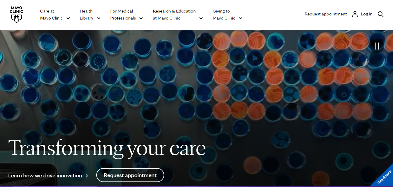
The first that made it on our list is the Mayo Clinic. It is a comprehensive online resource for healthcare information and services provided by Mayo Clinic. It is a nonprofit medical practice and research institution. You may know about this healthcare website since it provides a diverse range of topics in the healthcare field and provides definitions and innovative research for users. If you want to search for any diseases or learn more about any medication, this healthcare website provides information on various health topics, treatments, symptoms, diseases, and preventive care.
Here is what we like about the website design: The Mayo Clinic website is known for its minimalistic and clean look, with clear navigation and impactful CTAs. Not only this, but it also provides users with adequate information and has built trust with users through constant blog and information updates. This can only happen through the power of a well-made website design. The first thing users will be greeted with is their moving background, which is a short clip about healthcare discovery that looks convincing overall. The website structure is designed with easy navigation, clear and precise labels, organized categories, and a search function that effectively guides users to the information that they need directly. One important thing to notice is the clean factor of the website design layout. It does not have too much information scattered around. If a user were to see a healthcare website with too much information on the landing page, that would overwhelm them, and they wouldn’t know exactly where to go from there. The website design aligns with the Mayo Clinic branding and includes multimedia effects.
Overall, All these factors contribute to a clean, clear, informative, and user-friendly website design that earns trust and recognition.
Learn more about interactive website designs with these examples: Top 25 Interactive Websites To Learn How to Make Your Own.
2. Hartford HealthCare
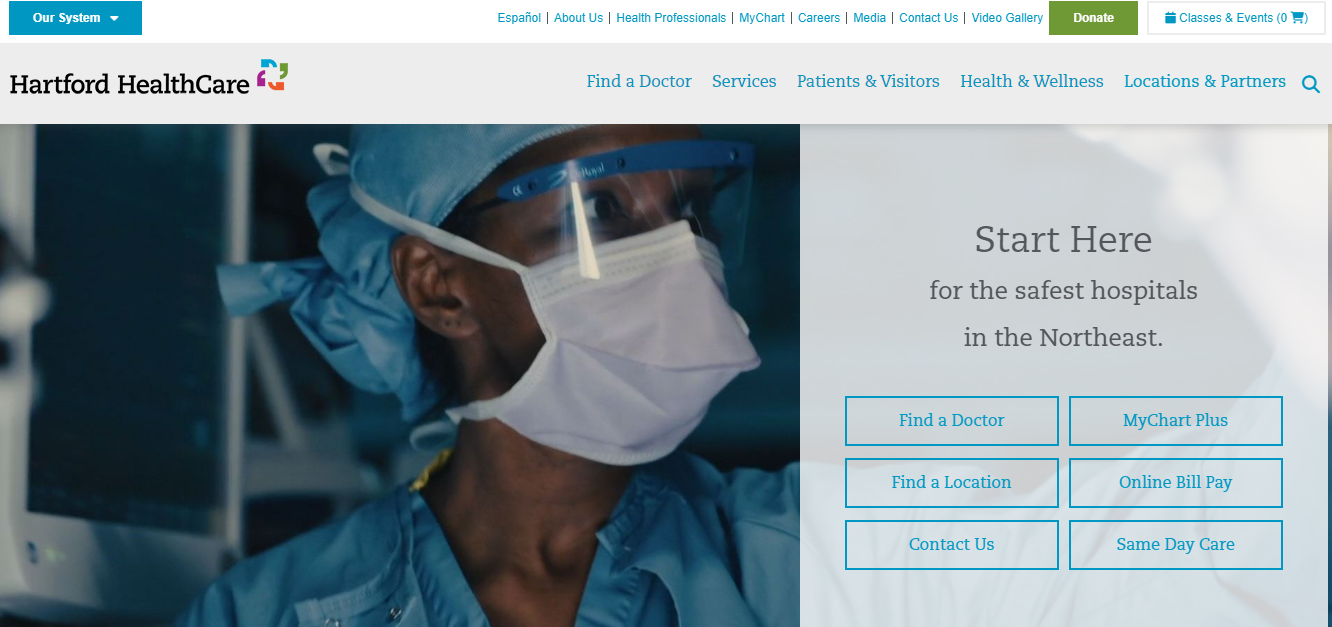
Here is another great healthcare website design example that we added to the list, and it goes by the name Hartford Healthcare. This healthcare site design is a pivotal example of what healthcare website designs should aim to be like. It encompasses the perfect balance between professionalism, trustworthiness, and a user-friendly interface that provokes a welcoming feel for users. The website design and layout are balanced and feature an appropriate number of calls to action. The clear and direct navigation ensures that users will not get lost on the site since it contains a lot of information. Everything is labeled very well, and if visitors are searching for a doctor or a location, the website design has a premade link for users to directly click on so the site will redirect users to that specific page on the site.
Here is what we like about the website design: One of the main standout features of this healthcare website design is that it seamlessly integrates with the organization’s patient portal and has its “MyChartPLUS.” This portal allows patients to access their medical records, making it more organized for them to keep their records all in one place. This is also a great way of making visitors revisit and access the website while taking action on it. This healthcare website design reflects the organization’s purpose and makes its purpose clear to new visitors.
Overall, the Hartford Healthcare website can be considered as a model for new healthcare sites. If you are looking for a way to make your healthcare site similar to this, then this is a great approach and example as well. The communication on the website is clear, and the overall layout is not intimidating; instead, it is straightforward. The website does a great job of keeping itself engaging through the use of videos.
3. Healthline
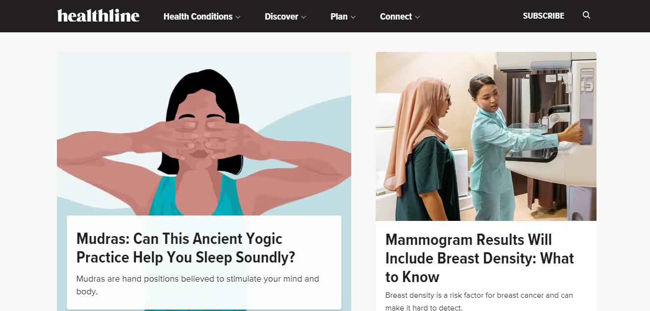
Healthline is a healthcare website that primarily focuses on spreading media and blogging about the basics of healthcare. It is a good example of a healthcare blogging site since it covers a diverse range of healthcare-related and general topics. It is known to deliver precise and engaging content, and many people see this as a reliable source for accurate information.
Here is what we like about the website design: The best feature we like about the Healthline healthcare website design is its simplified nature. This enhances user experiences, and the overall design is intuitive, making it easy for users to navigate and find their desired subject of interest on the site. Additionally, the site uses a smart amount of whitespace to enhance its clean healthcare aesthetic. Too much color on healthcare websites could be overwhelming. There is a search function, which is considered a staple for healthcare sites since there is so much wealth of information. The custom search function on the site makes it easier for users to find their desired information.
Overall, the healthcare website design layout is simple, concise, and clear, making it accessible for users of all levels to access medical-related information. The addition of personalized tools also makes the whole process of searching easier. The website design layout is pleasing and user-friendly, which is the most important aspect when it comes to a successful healthcare website design.
4. Athenahealth
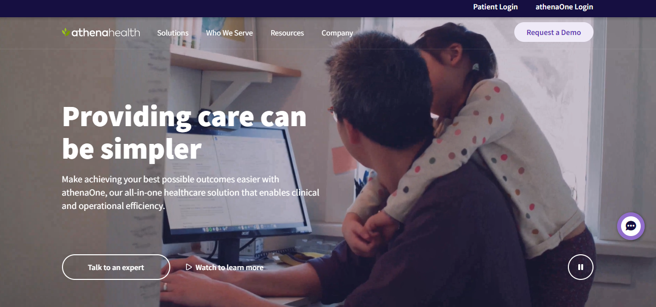
Athenahealth is a straightforward and classic healthcare website design that sends the right message to its target audience. Video backgrounds are increasingly popular these days for healthcare website designs, and you can see here that this strategy is successful. As soon as you land on the homepage of this website, you are greeted with a welcoming action heading: “Providing care can be simpler.” This sends a message to its users that they are here to make healthcare facilities easier. It carries a strong aesthetic that a healthcare website design should.
Here is what we like about the website design: the functionality of this website design is smooth and offers a strong user-centric approach. The overall platform catered to healthcare professionals and patients, offering them a seamless solution and intuitive experience. The overall layout of the healthcare website is clean and simple, with the right amount of CTAs on the homepage. The main focus of the website design here is visualization to show the users how this is a trustworthy healthcare platform instead of them having to read it.
Moreover, Athenahealth’s strong approach to accessibility makes sure that the healthcare platform can be used by individuals with disabilities, promoting inclusivity in healthcare. By prioritizing user experience and benefiting from technology to enhance healthcare delivery, Athenahealth’s website design sets a high standard for the industry.
5. Rest Assured
Here is another great healthcare website design example that shows the power of using whitespace and keeping the layout as minimal as possible. Rest Assured is a healthcare website that caters to seniors and individuals with disabilities. They have openly demonstrated their principles through their website design, which is a creative and strong way of delivering the right message to the right audience. It makes the message even clearer with the help of videos.
Here is what we like about the website design: it is accessible to all users, but its primary focus is on seniors and disabled individuals. The key takeaway in this website design is that they split half of it, with the right side including a short video and the left including precise information. This uses white space to its advantage and further provides a clean look to the overall healthcare website design layout. There are high-contrast fonts, easy-to-use keyboard navigation, and large buttons to support clicking. The company understands its primary audience and created a website design based on its audience while keeping other users in the loop as well. There is accurate text on the images, and that further supports visitors in finding their way through the website without any hassle.
When it comes to creating a website design for your audience in the healthcare sector, it is important to know your audience and who you wish to target. This also ensures that the website is accessible to all but mainly to the intended user. If you are looking for such solutions, hiring the right website design agency, such as WebsVent, opens up a wide variety of customized solutions for your healthcare website design strategy. With a team that is dedicated to learning about your target audience, our first focus is to create a website design that will attract the right customers to show that you have a website platform that caters to their needs and builds trust and credibility. From easy navigation features to simplified healthcare design aesthetics, WebsVent can deliver you the right healthcare website design that sends the right message to your intended audience.
More to know: 10 Best Affordable Web Design Companies in 2024
6. Maven
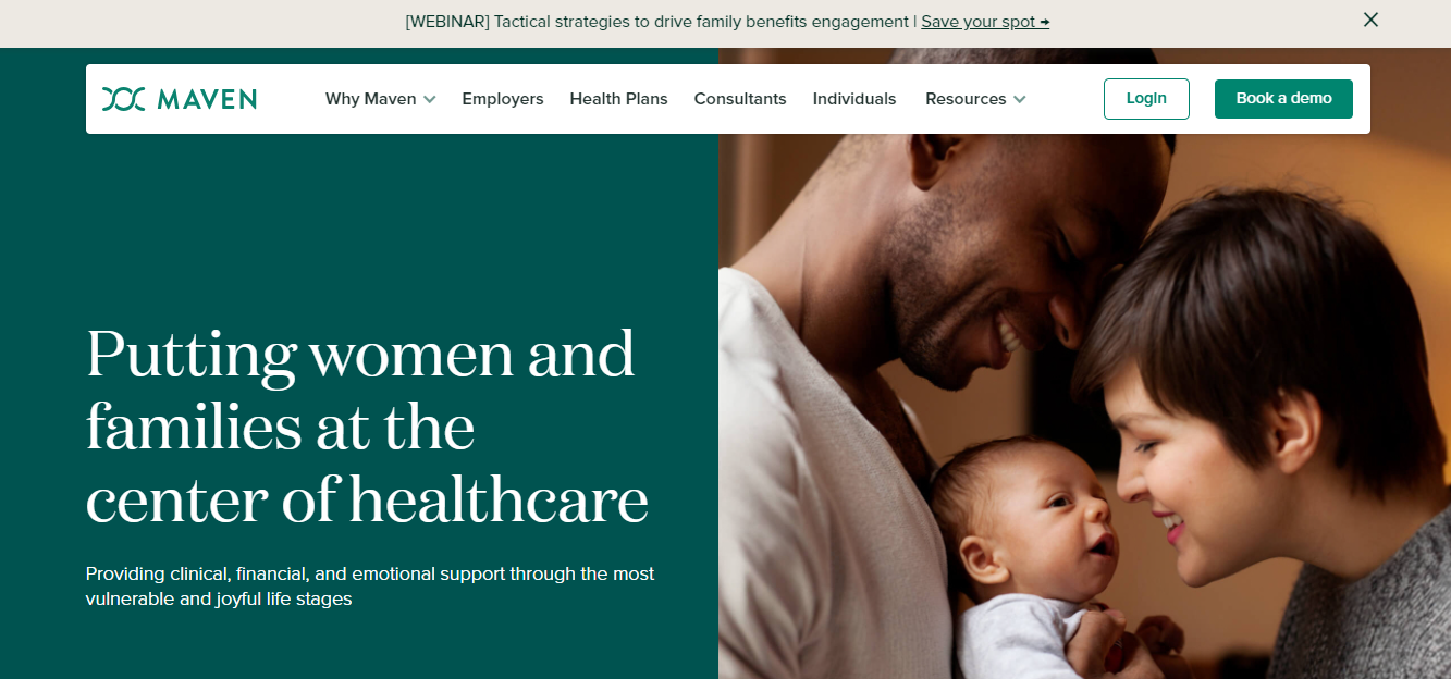
As soon as you land on the Maven homepage, you are instantly greeted with a warm and welcoming image. After that, you can see their target, which is healthcare for women. Their heading makes that clear for visitors and users to see. So, this healthcare website design is a great example of a direct approach to showing visitors what they specialize in. The color combination is a great match as well. Dark green and white show a deliberate, clean approach that looks very natural. Additionally, the screen is split in half, where the left side has text, and the right side has a comforting and promising image.
Here is what we like about the website design: If you carefully look at the image, you will see that the healthcare service took this. There is no stock image, which builds more trust with the viewers since they try to capture and display an image themselves. The rich use of color and photography provokes credibility and a sense of excitement and positivity. There is a CTA that mentions “book a demo,” and the green, in contrast with the white, creates a comforting feel. The imagery represents and demonstrates the understanding of Maven’s branding, design, and message.
7. MedLink
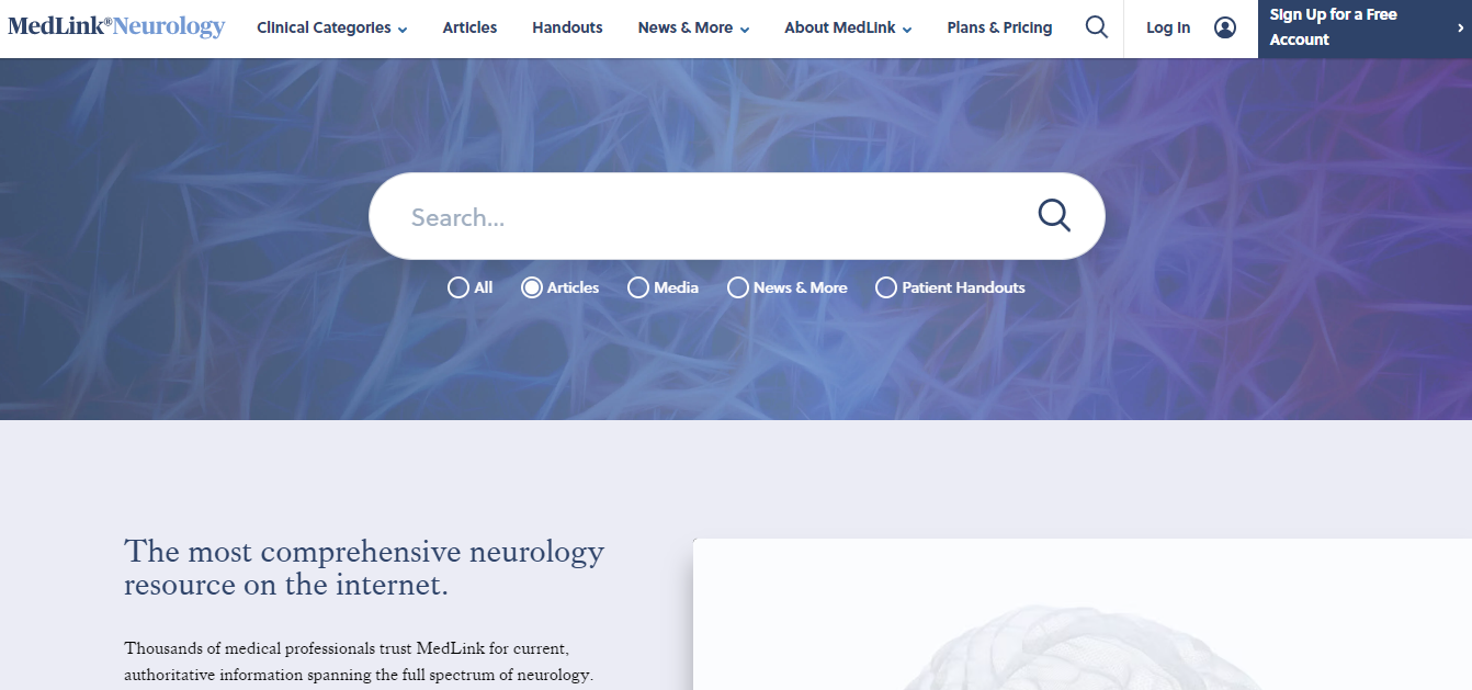
We added MedLink to the list of the best healthcare website design examples because it delivers a straightforward message and looks very professional and clean. This healthcare website is recognized as one of the top neurological healthcare websites that provides resources related to this field of study. As you land on their homepage, you see a big search feature that is practical and also customized; under the search bar, you can see 4 options for users to choose from, making it accessible and the searching process much easier.
Here is what we like about the website design: The MedLink healthcare website design layout is very simple and classic, not all healthcare website designs need to look completely different. At the end of the day, the target audience is what matters, and since this website design is targeted towards neurological services, keeping it simple was the best option. The colors chosen are also mellow, another considerate option for those who may find it hard to see bright or dark colors. One creative element here is the background of the search bar. You can see that it resembles the neurons of the brain.
Overall, the website design layout is clean and easy to see, but it is impactful. It sends the right message to its users and target audience and has the right amount of text on the homepage.
8. HealthMatch
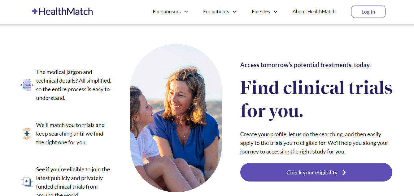
Lastly, we have HealthMatch. This healthcare website design is the best example of how much whitespace matters for healthcare websites. While it may not be necessary, it is still a great way to keep the overall design simple and make the text clearer to read. Everything you see on the homepage is clear and direct. We will add that the text is on the heavier side, but because of the whitespace, it does not look too crowded.
Here is what we like about the website design: the uncluttered homepage features a promising and prominent button called “Check your eligibility.” Since the background is white, it was only normal to make this button colored, and that is a strategy to instantly make the user gaze to move there. The homage is uncluttered, mostly because the background is white, and the content is engaging, which is vital for the company’s success in attracting eligible participants. There is a simple navigation bar, and the labels are all clear, such as “For sponsors,” “For Sites,” “For Patients,” and “About HealthMatch.” This makes the whole homepage organized and clear, just like users can navigate easily without any hassle. This strategy keeps the user focused on their main objective, which is to manage clinical trial details and participate in a trial. Making sure every step on the website meets with the user’s intentions and motive, the design streamlines the journey, eliminating confusion and encouraging users to complete the desired action effectively and effortlessly.
Read more: Affordable Web Design Company.
Get the Best Healthcare Website Design With WebsVent
There are many healthcare website designs on the rise. Most of them are still struggling to be discovered, and that can be a huge problem. It does not matter how the website design looks if it is not optimized and responsive. This is why you should opt for a professional agency that specializes in creating optimized healthcare website designs. You want to deliver valuable information to your target audience and leave a lasting first impression on them. Well, that can only happen when your website is easily discovered.
WebsVent is a specialized website design agency with a team of experts in crafting custom and optimized healthcare website designs. We ensure that your healthcare site is interactive and engaging for users and delivers the right message in one go. Seamless functionality and user interface to deliver enhanced user experience are what make a successful website design in the first place. Simplify your healthcare website designing journey with our services and launch a professional and perfect site in one go to make a lasting and strong first impression on users.
Related Blogs
How San Antonio Small Businesses Can Benefit from Custom Web Design
Why Your Website Needs Regular Updates & Maintenance to Stay Relevant in Long Beach
Tech Trends & Innovations
Discover the latest trends in website design, web development, and tech breakthroughs. Stay inspired with fresh articles and in-depth case studies to fuel your digital creativity every day.

