Oops! We could not locate your form.
Top 25 Interactive Websites To Learn How to Make Your Own
Have you ever wondered how interactive web pages engage users and viewers? Did you know that through a well-made interactive website design, you could reduce bounce rates and increase traffic to your website, making you appear relevant to SERP bots? If you are curious to get the answer to these questions and you wish to learn more about unique interactive websites, you have come to the right place!
The best websites are usually those that are designed with the users in mind. Interactive websites are successful in many ways since they focus on user-centric designs. Not only are these websites personalized, but they are also playful, giving the users control over what they do on the website. When it comes to interactive websites, users are invited to click on navigation items, scroll and see how the designs or the website shifts, and participate in other ways. This results in users focusing on the website, indulging in the creative designs, and, best of all, staying to view more. The cherry on top is a more active and unforgettable user experience.
In this blog, we will showcase the best interactive website design examples to inspire you and guide you in integrating similar features into your own web design. We will also provide practical steps to make your site more interactive, ensuring that you can achieve these results with ease.
Uplift Your Website With These 30 Web Design Trends For 2025
What Are Interactive Websites?
Interactive websites are the complete opposite of traditional static websites, where users would simply view content and services. Interactive websites have a purpose, and their aim is to encourage user participation, keep users and viewers on the website for longer, and enhance overall engagement by adding special scroll features and fun surprise clicks. Interactive websites are known to be delightful for users. However, this does not mean that you skip static websites altogether and go on making interactive websites. Interactive websites can be done in subtle and more explorative ways. This also depends on the kind of brand you are, what you are promoting, and so on. For example, a florist shop can create a visually stunning and fun interactive web design but say you are a licensed mortuary cosmetologist, your website should stick to being simple… I believe.
Top 25 Coolest Interactive Website Designs
1. Campo Alle Comete: Interactive 3D Models and Content
Campo alle Comete translates to “Field of Comets” and is a winery located in Bolgheri, Tuscany, Italy. It’s part of the Feudi di San Gregorio group, known for producing quality wines from Campania.
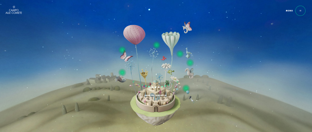
When you view their website, you will experience a series of features that will keep you on the website to view more. From the 3D designs and click interaction strategy, this interactive web site design has made viewing wine more fun and compelling. Each green dot you see in the image above represents each wine category, and you can learn about them before purchasing them.
2. (UN)TRAFFICKED: Interactive Websites for a Cause
(UN)TRAFFICKED is an interactive digital story created to draw attention to the child trafficking crisis in India. This interactive site follows a 13-year-old girl through a life-changing week, allowing users to make decisions that will impact the story’s outcome.

The game features a soundtrack that includes real-life stories about the heartbreaking statistics of child labor and sexual abuse in India. After playing the game, users are encouraged to take action by signing the pledge and sharing it on social media. This game is the digital centerpiece of a large-scale campaign by the Kailash Satyarthi Children’s Foundation and the Children’s Investment Fund Foundation to end child exploitation in India. It demonstrates the power of interactive web design in raising awareness and promoting change.
3. Fern: Visual Interactive Elements
Fern is an Atlanta-based studio that specializes in animation, illustration, and storytelling. Its website features various interactive elements, such as horizontal scrolling, animated text, GIFs, and video backgrounds.
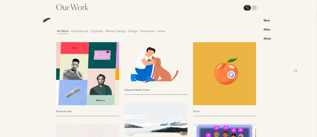
This is one of the best interactive website examples, not too much or too little. It includes a series of GIFs and other interactive visual elements, such as the background changing as you scroll and the themes changing, so you keep seeing something new. Their short descriptions are another kind of strategy where there is a higher percentage of attention-grabbing visuals and less reading to keep the viewer engaged throughout. This is the perfect combination of informative and interactive.
4. Cyclemon: Parallax Scrolling
Cyclemon is an interactive illustrated website created by two French designers.
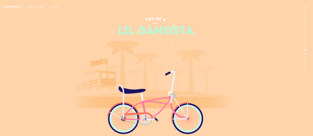
The parallax scrolling technique is a traditional method of keeping your viewers engaged by creating an illusion of depth in a 2D scene. The Cyclemon website allows users to scroll through different cycle models paired with identities. This way, viewers will either want to go through the whole website to see what kind of cycles there are with the identities attached, or they can stop scrolling to the one that fits them best. Parallax scrolling gives the illusion of traveling, and these designers couldn’t have done a better job.
Enjoying these website examples so far? Read our blog, “Top 20 Game-Changing US Web Design Companies For 2025,” for more fun website ideas.
5. ANNONSØRINNHOLD: Scrolling Visual Interaction
Yet another beautiful interactive website design for a cause. ANNONSØRINNHOLD was created for the Norwegian Salvation Army, which includes an illustrated cityscape where an individual Army stands in front, with a collection bucket open for people to donate to a cause.

This interactive website design features the winter season, where there is snow in the background, and as you keep scrolling, the background changes, showing the viewers a story. This is a beautiful and meaningful design, even without the scrolling effect, but of course, it adds to the whole interactive aspect of the website. These interactions made it possible for viewers to understand the depth of the cause, creating an emotional connection with the viewers.
6. Ohzi Interactive: Stunning Visuals & Interactive Play
As you view the homepage for Ohzi Interactive, the whole layout has a futuristic, 3D look. The beginning of the website shows the “Dive into Digital Magic,” which literally means that you dive into the website, and that is how the interaction process for viewers begins.
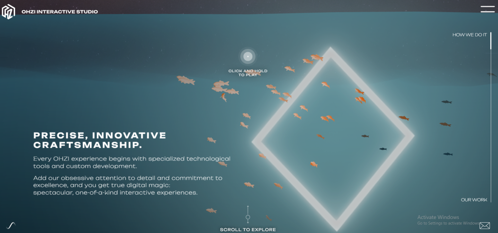
The interactive design begins with luminescent cutes and transcends to Starfire-like confetti explosions. For a moment, you forget that you are scrolling. The whole interactive website design effect feels like you’re entering several dimensions. These are some of the most unique interactive websites that we have come to access, and we are happy for you to gain inspiration from them.
7. Artificilia: Viewing Art On A Whole New Level
Artificilia is an online gallery for Bridgette Ashton’s artistic work. The art includes beautiful antique, crystal-like, and delicate designs that show almost a real-life view of what they are.
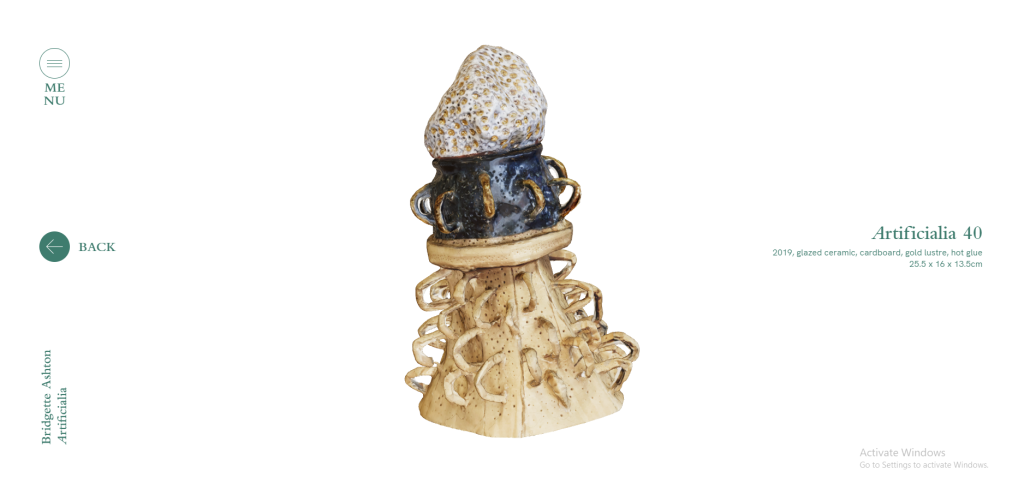
This interactive website features sideward scrolling to view the individual pieces and whichever art piece you are interested in. Once you click on that, it opens up in full view, allowing you to get a whole 360-degree look from top to bottom. Additionally, there is a light reflection against the item to show the viewers the glazed look that the product features in real life.
8. Zendesk Museum of Annoying Experiences: 3D Interaction to a Whole New Level
Zendesk creates tools for businesses to help them communicate and stay connected with their customers. One of their interesting projects is the Museum of Annoying Experiences, which takes you on an augmented reality journey through common frustrations that consumers encounter. The focus here is on comedy, providing laughs as we recognize all the aggravating things we experience in our daily lives.
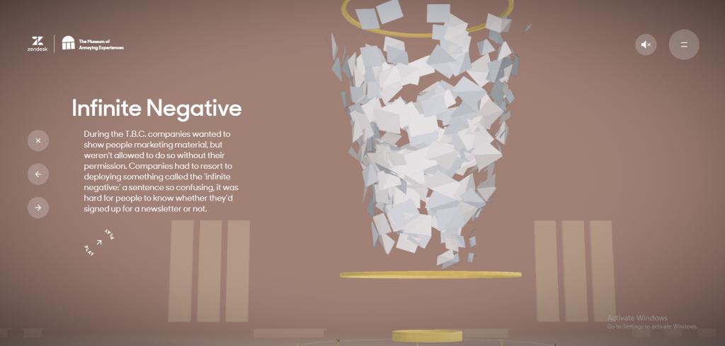
This interactive website example features 3D models and cursor dragging to view different parts of the site. You can also click on certain features to view more information and what else they have to say about the topic they have chosen to discuss. The website also features a game that viewers can play through and stay engaged to discover more about the site. As pure brand marketing content, this interactive website example is purely about entertaining, with Zendesk providing a joyful romp through all that we find exasperating. Pretty creative!
9. My Developer Journey: Interactive Storytelling
My Developer Journey is a complete background story interactive website design. The protagonist is Bruno Santo. He tells his viewers about his achievements and the whole journey through the power of a creative and interactive website design.
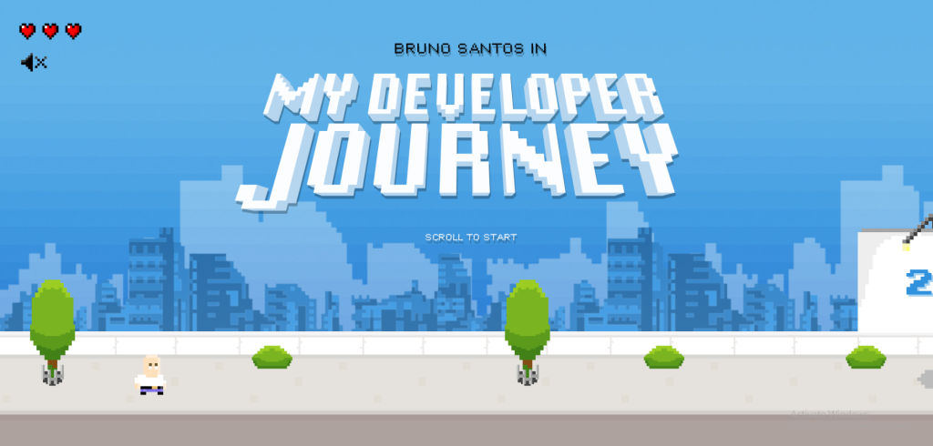
This interactive website design gives off a nostalgic effect and reminds me of Minecraft, but a less 3D version. It features horizontal scrolling, where the character moves forward, explaining their designer-to-developer journey in website design. This Nintendo-styled design offers more than a traditional portfolio website. It showcases Bruno’s imagination, design, and development skills, making it one of the most original interactive website examples we’ve recently seen.
Read more: 10 Principles Of Good Web Design.
10. Victoire Douy: Several Interactive Features in One
Here is another creative example of an interactive web page for a portfolio. Victoire Douy is a French illustrator and interactive designer who has put all of her talents and has yet to be discovered into this wonderful design.
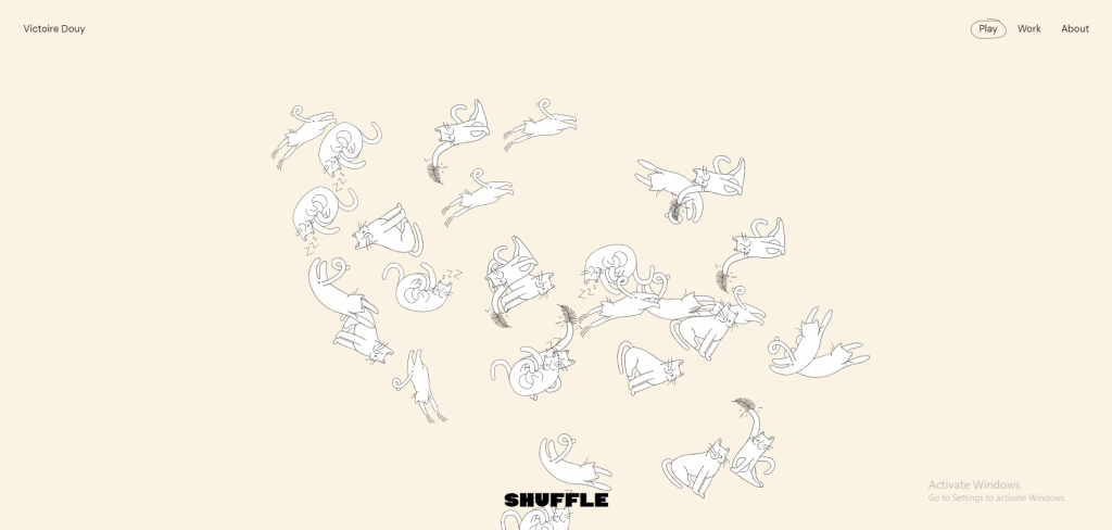
This website features several kinds of interactive elements, including animated effects, texts that jump, grab, hold, and move objects, and a string that is attached to other elements and tangles once the cursor goes over it. Together, these elements create a whimsy and fun design. This experimental portfolio, full of gorgeous visuals and illustrations, communicates her artistic aesthetic well.
11. Eamonn Day Lavelle: Faded Interactive Effect
Eamonn Day Lavelle’s portfolio website offers a great example of a simple interactive design. When you click “View Projects,” you are automatically scrolled down to a list of his projects. Clicking on any individual project redirects you to a more detailed landing page.
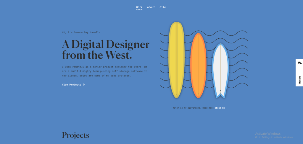
The page uses a fade-in transition effect to visually depict the loading process as it fades in and changes the background color. This site is optimized for performance, loading incredibly fast despite being coded with HTML5 and CSS3 and weighing less than 8MB. This proves that interactive design and website performance don’t have to be tradeoffs.
12. Foot Lockers Home Game: Colorful Interactive Elements
Foot Locker’s Home Game is a microsite designed and developed by CTHDRL. Its objective is to inform and encourage visitors to take part in a virtual basketball and sneaker contest on X (Twitter). Fans must follow along on social media and then enter gated challenges to win exclusive sneakers, merchandise, and experiences.
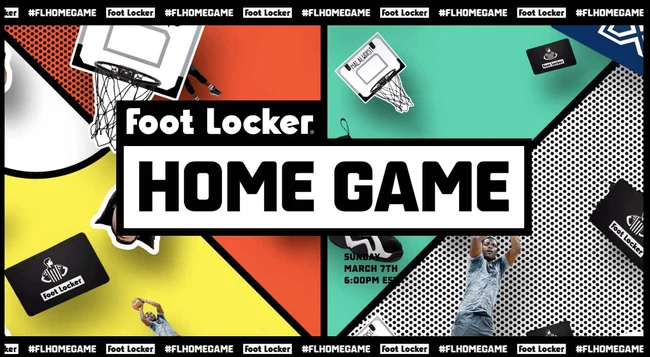
The website does an excellent job of seizing visitors’ attention and keeping it. When visitors first arrive, they are greeted by a colorful background resembling a basketball court. Paper cutout-style elements of basketball hoops, sneakers, and Foot Locker gift cards continuously fall across the screen. There are call-to-action buttons encouraging users to “Follow Along” throughout the page. These buttons change color and rotate when users hover over them. As users scroll through the “The Drops” section, cards appear, showing the available prizes.
13. Delve: Simple Interactive Design
Delve Architects, a London firm, infuses their website with a light-hearted and approachable feel, mirroring their commitment to creating a positive design experience.

Once the page loads, you are greeted with a combination of pastel colors and professional interactive features. The homepage is interactive, so users can see how they wish to navigate the site. By clicking on the pastel-colored blocks, you can learn more about their practice, read their blogs, and so on. This is a simple yet effective interactive website design.
14. Daniel See: Visual Interactivity
Daniel See is the Principal National Creative Director for Deloitte Digital Australia. He has been working in the digital industry for over two decades and has many projects to showcase.
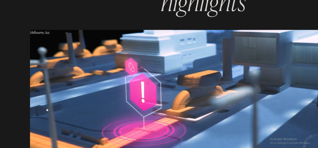
To make the viewing experience easier and more interactive, infinite scroll and fly-in animations are used to display projects one at a time as the user scrolls.
Related read: 10 Powerful Ways To Maintain & Level Up Your Website.
15. Prometheus Fuels: Interactive Gameplay Visuals
Prometheus Fuels invites viewers to engage with an interactive story about how their company is creating fuel from the air.
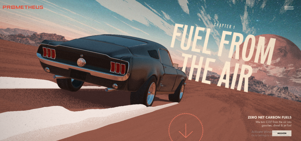
It’s basically half a website and half a video game. When users hover over the background, the car moves as if controlled by a game controller. If they hold the spacebar, they’ll see and hear the car accelerate. As the user scrolls and the car accelerates, bits of the story will be revealed.
16. Cycles Gladiator: Interactive Web Design For A Cause
Cycles Gladiator is a California-based wine company committed to empowering and inspiring women. Its website is a single-page interactive platform that allows users to find nearby retailers or restaurants that carry its wines, discover more about its partnership with the non-profit organization Do More Art, and sign up for its mailing list.

Each call-to-action includes a button with a subtle hover animation. At the bottom of the page, there is a slider for users to view their wine collection one bottle or can at a time.
17. Interactive Music Video: Interactive Music Video Website
This is one of those unique interactive websites that aren’t common but are unforgettable. Interactive Music Video is an interactive music video website that uses audio and video elements to keep viewers and users engaged throughout the site.
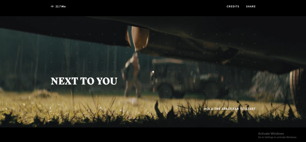
The video has cinematic features, and the music adds depth to the visuals. Users are meant to hold the spacebar in order for the video to start, and once they let go of the space bar, they go between the past and present of the movie. To really get what I mean, you will have to visit the site to get it.
18. Style Novels: Interactive Furniture Website
Styles Novels is a creative furniture website that features beautiful animations and high-definition photography. Unlike the ursula websites that showcase the products, Style Novels offers a unique display for their products.
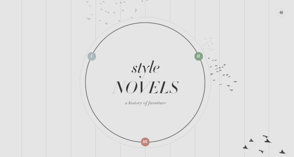
This interactive website design has a user-driven navigation system that enables visitors to learn more about their own preferences and needs for different products. This basically gives them the upper hand in the navigation aspect.
Are you interested in photography? Do you have a website to showcase your art? Read our blog, “How To Turn Your Photography Passion Into Successful Business (6 Verified Steps).”
19. Renaud Rohlinger Portfolio: Interactive Portfolio
Here is another enthralling interactive portfolio website where the designer and developer show what tablets they have and how epically they pull it off. Renaud Rohlinger Portfolio is an interactive developer portfolio site that features aesthetic and cute animations.
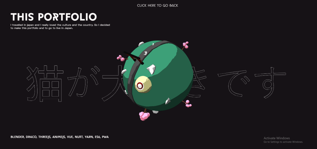
While viewing the website, you can see the 3D animations and the cute white cat that follows you around. The highlight of this interactive website is that it emphasizes Japanese culture. You will want to keep scrolling once you view this site. We encourage you to try it out.
20. Resn: Very Interactive!
Resn is a portfolio website for an interactive design agency that features a 3D crystal diamond. Visitors can rotate the crystal diamond to view all of the agency’s projects and switch between website pages. The website also offers a variety of cool page transition effects, including trendy fluid, shaking, and rotating effects.
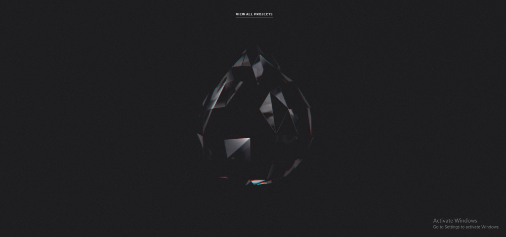
The fun interactive feature of this website is when users click and hold on to the diamond in the middle every time something unique and creative pops up. From lighters to hypnotizing designs, this interactive website is clearly out of the box! This interactive website design really shows its viewers what the designers and developers are capable of. Viewers will want to know what is next, and this alone makes them stay on the website for longer to discover more about the side and to enlighten their curiosity.
21. Navigator: Unique Interactive Navigation
Navigator, as a teamwork assistant site, is a clean and interactive website that helps people run productive and meaningful meetings through simple conversations. It features an interactive and adorable robot on the Home page.
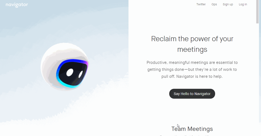
This interactive website shows that even simple interactive elements can be successful. It is not necessary to make everything more advanced; simplicity goes a long way as well.
22. APPS: Interactive Play Design
Apps is an interactive play design, created by VGNC Company for liquor brands. Although it is not necessary for such brands to create such an interactive website, it is not a bad idea either. Here this brand was successful in creating an interactive website that allows users to learn the process of making Apple Cider.

Before starting this interactive play or learning process about how Apple Cider is made, you will receive instructions. This action simulator gives a brief introduction to the cider-making process while still engaging users in a fun and interactive way on your website. Additionally, its simple and clean product page with a pleasing color scheme is remarkable, allowing visitors to focus on product features and boost product sales.
23. Polish Christmas Guide: Interactive Design For a Cause
The Polish Christmas Guide website is interactive and allows visitors to learn about Polish Christmas traditions. The site has a cute cartoon feel and is great for children. It features a game where kids can take a ride with Santa Claus, collecting gifts that represent different Polish Christmas traditions along the way.
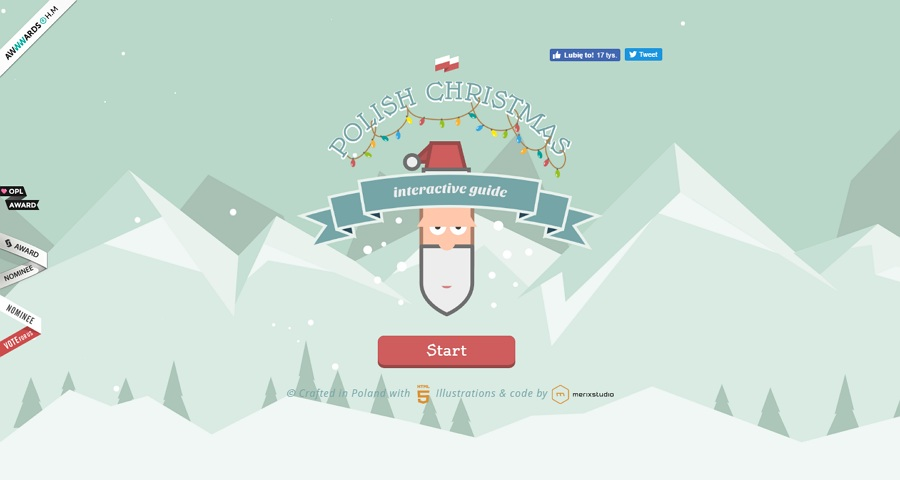
The website relies heavily on illustrations and voice activation, creating an experience more akin to playing an online game rather than simply browsing for Christmas gifts. This approach effectively captures and holds the visitor’s attention. Additionally, the site conveys strong messages about abused children, who are featured at the end of the Christmas game. This is an impactful method for encouraging people to support underprivileged kids during the holiday season.
Read more: Why A Florist ECommerce Website Will Improve Your Growth.
24. Pieces: Interactive Website For Endangered Species
Pieces is a unique interactive website with 30 separate pieces that can form animated animals, all of which are endangered species, like helmeted hornbills, Vaquitas, golden lion tamarins, golden poison frogs, and more. By simply clicking and scrolling, you can easily cycle through each animal and check its information and stories, including the dates of discovery, histories, videos, and more.
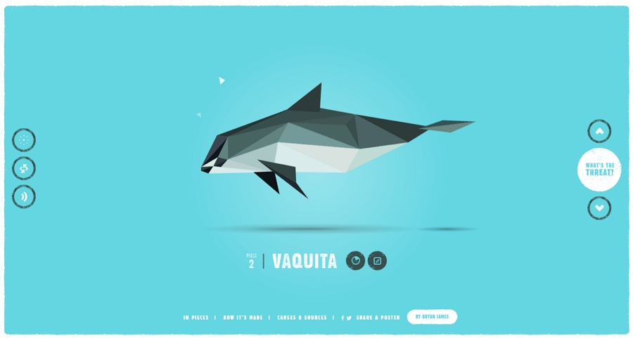
So, in this aspect, it is really a nice website that raises people’s awareness of the need to help and protect endangered animals in a vivid and visual way.
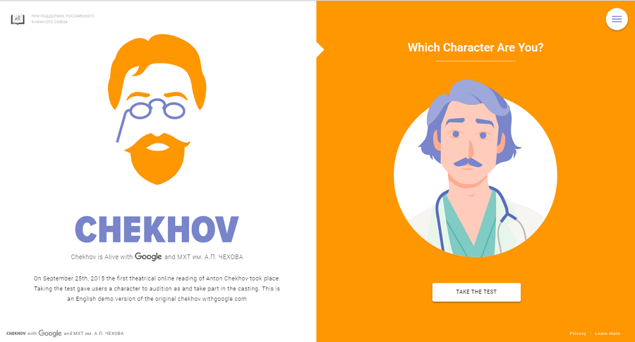
25. Chekhov: Illustrative Interactive Design
ChekHov is a fun, interactive website with a unique illustration style. It allows users to take a simple test that involves answering 7 questions to see which character they will be in Chekhov’s works.
Want to rank higher on Google? Interactive website designs can surely help since they are known to reduce bounce rates, improve user experience, and provide seamless navigation. A creative website with optimized content can, hands down, help you rank higher on the SERPs.
How To Make Interactive Web Site Design
Creating unique interactive websites can be time-consuming, and not everyone has the skills to do it alone. However, you can brainstorm ideas and then hire a professional and affordable web design company to bring them to life. This is a worthwhile long-term investment for you and your brand. Whether you need an interactive portfolio website to showcase your work or a complete site with multiple interactive web pages, you can reach out to Websvent for a free consultation to discuss the kind of interactive website you have in mind.
Let’s look into the steps of creating basic interactive websites and how you can achieve them:
1. Make Scrolling FUN
For interactive website designs, you do not have to limit yourself to the basic up-and-down scrolling. There are so many kinds of scrolling options, here we will look into the most popular scrolling patterns:
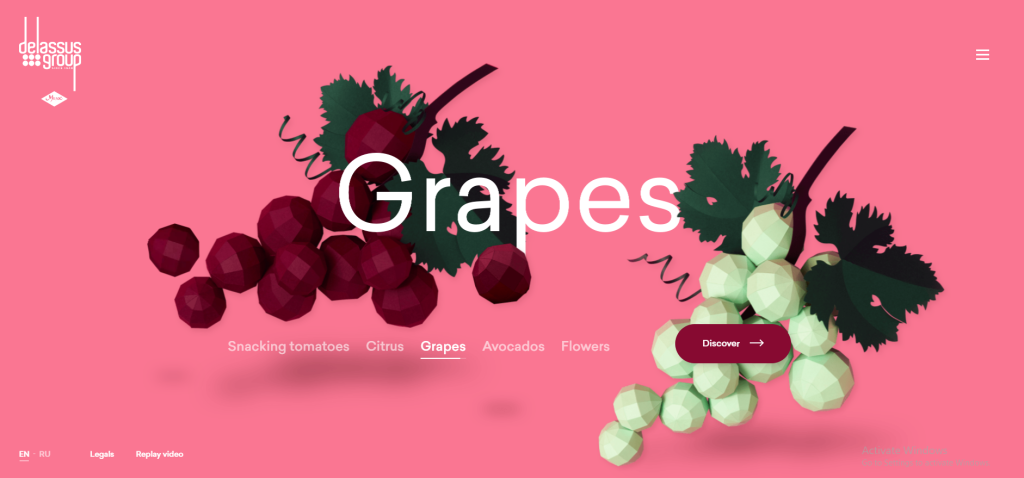
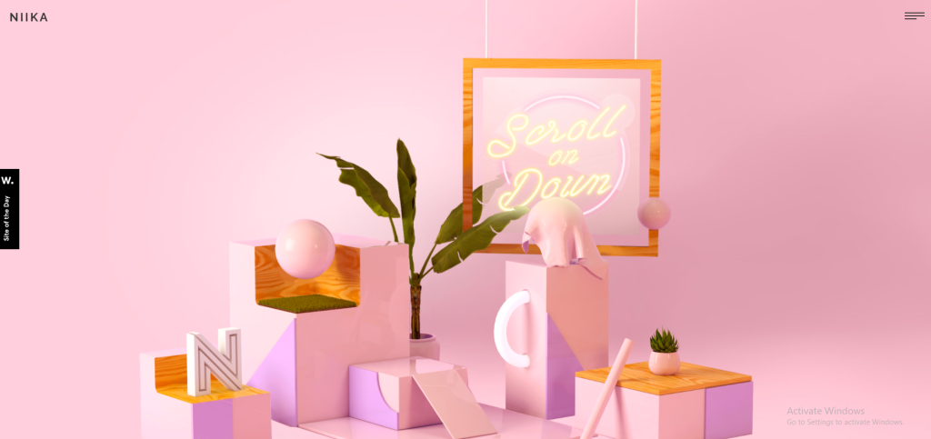
Parallax Scrolling: This style creates an illusion for the viewers and users. This works because some elements stay in their position while other elements move. The illusion here is that this makes some elements look like they are moving while they actually aren’t. This stimulates a 3D movement effect, creating a background. The speed for this kind of scrolling can vary. If users scroll very slowly, this may hinder the overall illusion effect of the site. Some websites advise giving users a little tip so they can slowly scroll in continuous motion.
The best interactive website examples for the Parallax scrolling effect are:
Delassus– Horizontal Parallax Navigation
Niika– Up/Down Parallax Scrolling with 3D Elements Moving Around
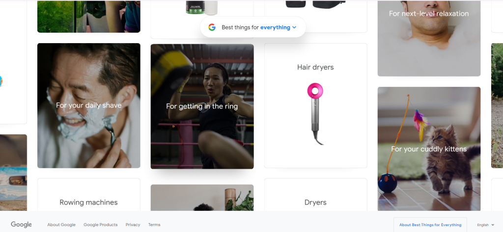
Infinite Scrolling: This scrolling pattern allows users to scroll constantly. The trick here is that the content does not remain the same; every second, something new, creative, and impressive shows up as you scroll. Colors shift, minor details change, elements move around and about, and the content or images change. Nothing stays the same. New content continuously loads as users scroll down. It’s often used in social media feeds and content-heavy websites.
Google Best Things: Continuous Scrolling With New Images
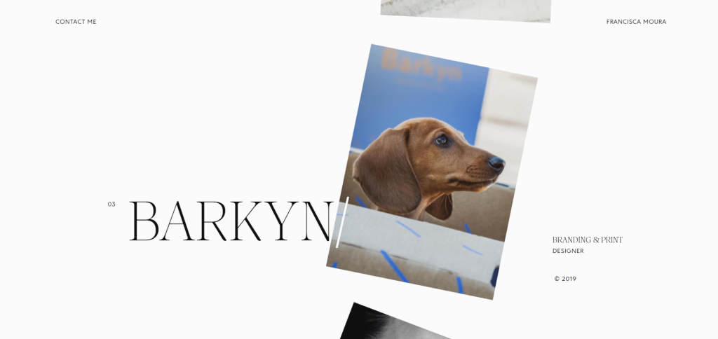
Francisca Moura: Short Continuous Scrolling Approach
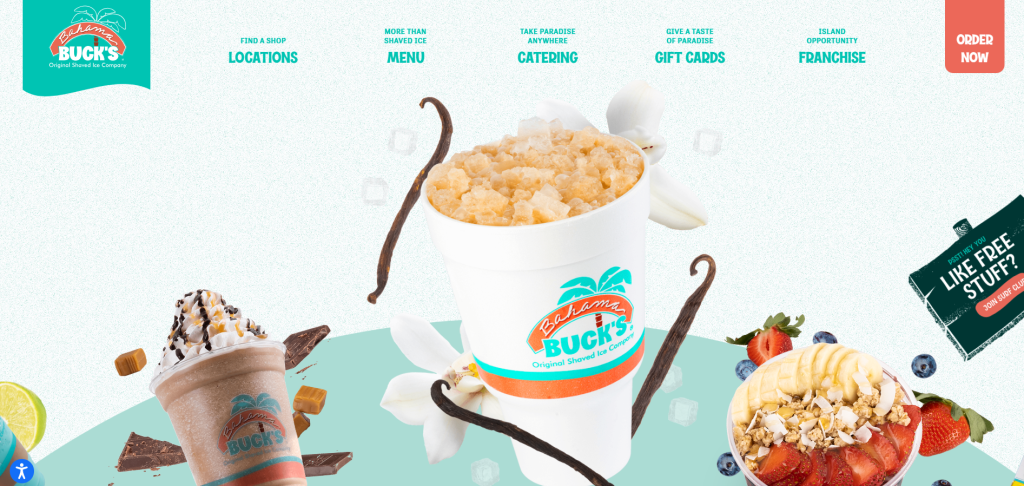
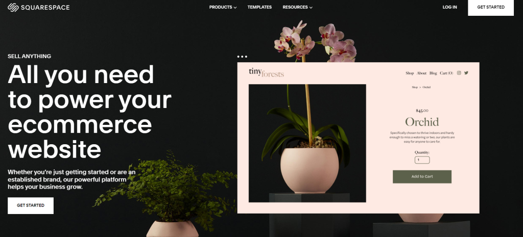
Carousel/Slider Scrolling: This style of scrolling involves a unique carousel navigation process, where users can click and hold, move the cursor right or left, and experience the carousel scroll effect. This interactive feature is popular for presenting images or products in a zoomed focus. Take a look at these two examples.
Bahama Bucks: Colorschemed Drag Carousel Pattern
Squarespace: Website Template Carousel
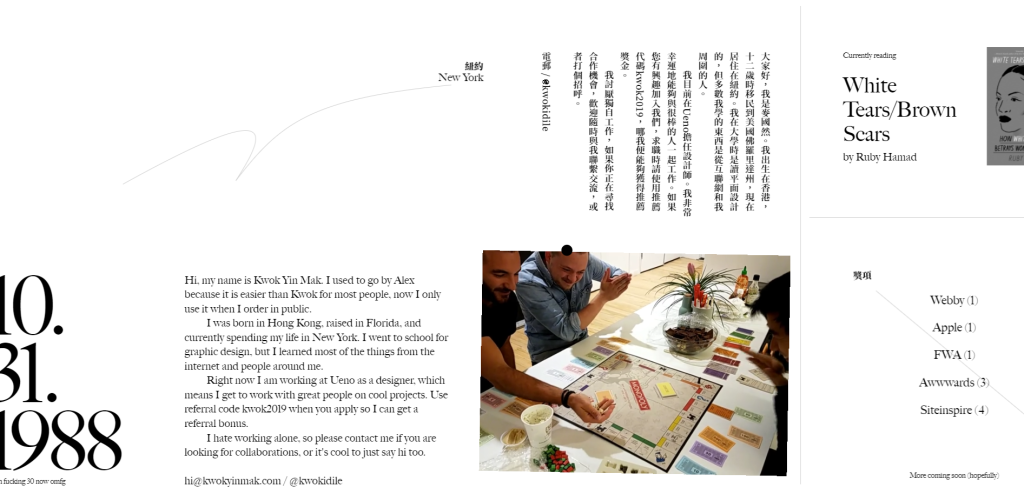
Horizontal scrolling: This scrolling pattern allows users to reveal content by scrolling left and right instead of the traditional up-and-down orientation.
Kwok Yin Mak: Continuous Horizontal scrolling
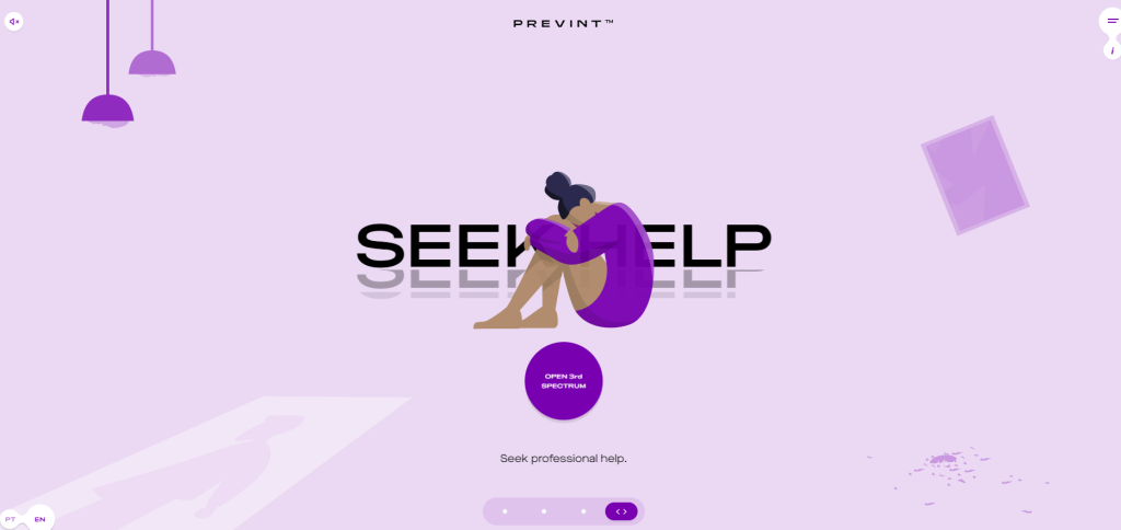
PREVINT: Website for a Cause Includes Horizontal Scrolling
2. Interesting Loading Animation
Loading animation may seem unnecessary to you, but in reality, it builds curiosity and makes your users a bit more patient during the loading process instead of seeing a plain black/white screen. Not many websites include this feature, but it has a drastic effect on interactive website engagement. Loading animation ensures that your page is working and is not stuck. It immediately makes your viewers more attentive to your website.
Monogrid: Pixel Loading Animation

ALARIS: Loading animation includes the brand’s own name

3. Hovering 2D/3D Animations
Interactive websites usually (not necessarily) include hovering 2D/3D animations. When users scroll through the site, these 2D/3D elements complement the entire outlook of the interactive website design. They can either be included in the background of the website or in the front, creating an illusion.
4. Include Short Videos
This is an unwritten strategy based on the knowledge that professional web designers have that users are more likely to press, play, and share certain features that are available on the website that they are viewing. Research states that almost 83% of video marketers state that videos have helped website owners generate leads. Videos take interactive websites to a whole new level.
Ready to Own an Interactive Site?
We have worked with several clients who dream of creating unique interactive websites, and we have happily made those dreams come true. It can be tricky to try making your own interactive website since it requires a lot of time, effort, and more money than you would have imagined. Interactive sites require an artistic mind to create a blueprint that maps out what kind of aesthetic matches your brand, products, and you.
If you wish to own the best interactive website, contact Websvent for affordable and innovative website development and design solutions. Our team of designers possesses extensive knowledge of all the current web development trends, including those that will be popular in 2025. Get your free consultation today with our expert team!


