In today’s growing digital era, owning a well-made website is one thing, but making sure it is functional and responsive is the whole other level for you to amplify your web designing game.
In this detailed and comprehensive article, you will learn about responsive design and how it differs from adaptive design, how to make your existing web design responsive, how to check if your web design is responsive and more. If you plan to create a responsive web design and want to find a professional, responsive web design service, contact WebsVent to gain all the benefits a responsive design offers.
Let’s begin by defining Responsive design in simple terms, and as you read on, you’ll grasp the concept better. Moreover, we’ll provide a brief list of websites as examples to help you visually understand what a responsive web design should look like.
What is Responsive Web Design?
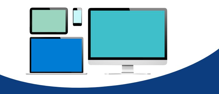
Responsive web design, also known as dynamic web design, refers to the capability of a website to adapt to different devices regardless of their screen size. This means that if your website looks great on a desktop computer, with stunning graphics and all features visible, it should also look the same on a smartphone or tablet, with the same quality, dynamic content, and graphics. In short, responsive web design ensures that your website is unrestricted and user-friendly across different devices.
Not only that, but responsive design responds to user needs by adapting to several screen sizes along with their separate orientation, layouts, and platforms. This is done with the use of flexible layouts, grids, and responsive images. It may sound simple, but it comes with a list of benefits for your business performance and allows you to gain more customers. Responsive designs are also considered to be preferred since not everyone has access to desktops all the time, and people prefer to search on their phones even if a desktop is available. Responsive web designs tend to reach more views, which is an added benefit for you.
The Purpose of a Responsive Web Design
Responsive web design offers benefits to users, web designers, developers, and businesses. It lets web developers and designers create a single website that can be accessed through various devices instead of building different versions for each one. With responsive web design, it is possible to build one website that adapts to any device instead of creating a separate mobile version in addition to the desktop version. The mobile-friendliness of responsive web designs also creates a better user experience for the many people who do their web searches or other activities such as shopping, booking appointments, banking, and much more. According to Google, almost 82% of US shoppers use their mobiles to make purchases and to stream online. These stats are increased during the festive seasons. People prefer to shop online through their phones since it is quicker, easier, and less of a hassle while making purchases.
Responsive web designs can also boost your site’s SEO performance. Popular search engines like Google recognize these websites and tend to filter out the most responsive websites. Responsive websites load faster and have better layout performance. Ultimately, this provides you with a seamless user experience (UX).
As you come across responsive web design, you are also highly likely to come across adaptive designs. Add simple definitions covering it all up to make this section short and easy.
Responsive Web Design: this is a strategy that makes websites look good and function flawlessly on all devices, regardless of their sizes, from desktop computers to smartphones and tablets. It’s like having a website that automatically molds its size and format to adjust to the screen it’s being viewed on, just like how your clothes can fit different body shapes.
Want to make your website responsive? Visit WebsVent for a flawless experience.
Adaptive Web Design: Before loading a website onto your screen, this approach detects the size of the screen and then loads the website accordingly. An adaptive design is used to create static layouts based on breakpoints that don’t respond once they are loaded. This means that the design is not completely flexible. A different layout needs to be created for each device to accommodate every device, which means a separate web and mobile version. Adaptive design is best suited for smaller sites that require redesigning.
How does Responsive Web Design work?
Here, you will learn about responsive design functionality and other technologies that make this process possible.
Responsive web design (RWD) is a design process that allows a website to translate according to your screen size. This means that whether you’re browsing on a giant desktop monitor or a tiny phone. The website will modify itself to fit the screen perfectly. RWD utilizes a combination of flexible grids, fluid units (percentages instead of pixels, and media queries that sense the screen size and adjust the layout accordingly. These media queries adjust things like the number of columns in the grid, the image’s size, and the buttons’ positioning. The result is a user-friendly and visually appealing website, regardless of the device being used. You can think of it like a building that can reconfigure its rooms and furniture based on the number of people occupying it. For instance, on a large screen, you might have a spacious living room with a coffee table and comfy chairs. However, on a small phone screen. The same space becomes a cozy reading nook with a single armchair. It’s the same website, but it adjusts to various sizes, providing a seamless experience for users.
Just like it is on the desktop, it is exactly the same if you view it from your phone: the animations, graphics, small added features, scrolling, and overall experience.
From the tiniest of details to its entire layout, you can view this website on your smartphone and tablet and gain the same experience that you would get from viewing it on a desktop. Additionally, the navigation and overall user experience are flawless for this website.
Navigation, website effects, and everything else about this website are perfectly translated onto a smaller device for your convenience.
Software Programs to Use for Responsive Designs
Various software programs are available for programmers and developers with technical expertise that allows them to create responsive websites. Some examples of such programs include Adobe Dreamweaver and Bootstrap. In the table presented below, we will compare different programs that can be used to develop a responsive website without the need to write any code. This table can be helpful to compare the costs and features of different software programs that come with built-in RWD capabilities.
However, if you are looking for a team of professional web designers who offer responsive designs in their services and more. Click here and get started with our new project today!
We would like to mention that Google has a set of criteria that it considers while evaluating the design of your website. Whether you plan to create your own website or hire professionals to do it for you, it is essential to ensure that you follow those guidelines. One of the important features that you should not miss out on is the responsive design feature.
If your website is not compatible with multiple devices. You can check whether it shows up in the top five search results on Google. Normally, the first 4-5 websites that Google filters out are deemed relevant and are frequently chosen by viewers.
How Do I Check if My Website is Responsive?
As we mentioned previously, Google or any other good search engine can decipher whether your website is responsive or not. Still, sometimes, it is good to go a step further and manually check your website’s responsiveness.
You can opt for thorough, responsive testing tools such as BrowserStack, Pingometer, and Responsly, which offer a wider device and browser compatibility option. These tools let you test on specific devices, screen sizes, and operating systems for a more comprehensive assessment.
You can go a step further and manually test your website to check if it is responsive. Although time-consuming, manually testing your website on various devices, phones, tablets, and laptops can still be invaluable. This gives you a firsthand feel for the user experience on different platforms.
What to look out for during the testing phase:
Layout adjustments: Images, text, and elements should resize and reposition naturally to fit the screen.
Font readability: Text should be legible and appropriately sized for each device.
Touch interaction: Buttons and links should be sized and spaced for easy tapping on touch screens.
Navigation: Menus and navigation controls should be accessible and usable on smaller screens.
Overall performance: The website should load quickly and function smoothly on all devices.
Now You Know All About Responsive Web Designs
Always remember that responsive web designs are better than keeping your website as it is. Specifically, if your website includes booking, shopping options, or online services.
The type of services you’ll need for responsive web design can vary based on the scale of your project. Hire either a freelance web designer specializing in RWD or seek help from a professional web design agency. Generally, a responsive web design company or agency offers several services, including design, development, marketing expertise, and strategic recommendations. To ensure you make the right choice, do some research on company reviews and examine their previous work.
It’s also a good idea to search the internet for examples of responsive websites that you like. Try to find websites that cater to different types of users and offer different capabilities. Such as websites selling digital products or displaying artwork. That way, you can draw inspiration from the variety of possibilities.
Did you know that 94% of first impressions are related to a website's design? It’s hard to believe, but it is the truth. As a business owner, it is time...
Getting bored is one thing, but zoning out and endless scrolling on social media platforms is another. Isn't it better to use that bored energy on random websites designed for...
Have you ever wondered how interactive web pages engage users and viewers? Did you know that through a well-made interactive web site design, you could reduce bounce rates and increase...


 Seo Manager
  June 11, 2024